The 24-Hour Website Audit: 5 Tweaks to Double Conversions
When your small business website isn't generating the leads or sales you expect, the initial reaction is often panic—followed closely by the assumption that you need a complete, expensive website redesign.The reality? Most small and medium-sized business (SMB) websites don't need to be burned to the ground and rebuilt from scratch. Often, the barrier between a bouncing visitor and a paying customer comes down to a few minor points of friction in the user experience (UX).You can significantly increase your conversion rate optimization (CRO) without touching a line of complex code or spending thousands of dollars. Here is a 24-hour website audit with five actionable, low-cost design tweaks you can implement today to start turning traffic into revenue.
Pass the "3-Second Rule" Above the Fold
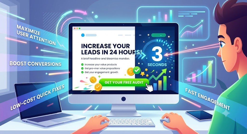
The “above the fold” section is what visitors see on their screen before they even touch the scroll wheel. You have roughly three seconds to answer three questions for the user: What do you offer? How does it make my life better? What do I do next?
If a user has to scroll or click around to figure out what your business actually does, they will leave.
How to fix it today:
- Sharpen the Headline: Replace vague, clever taglines with a clear, benefit-driven headline. (e.g., Change "Innovating the Future" to "Affordable IT Support for Local Dental Clinics").
- Add a Sub-headline: Use a brief sentence right below the main headline to explain exactly how you deliver on that promise.
- Feature a Primary Call to Action (CTA): Ensure there is a highly visible button immediately available (e.g., "Get a Free Quote" or "Book a Consultation").
Declutter Your Main Navigation Menu
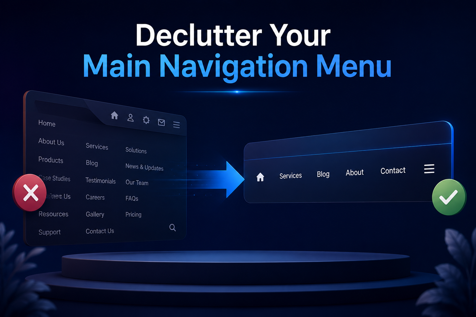
Many SMBs treat their top navigation menu like a filing cabinet, stuffing it with links to every single page on the site. This creates cognitive overload. When users are presented with too many choices (the Paradox of Choice), they often choose to do nothing at all.
Your navigation should be a streamlined highway guiding visitors directly toward your most important conversion goals.
How to fix it today:
- The Rule of 5: Limit your top-level navigation to no more than five to seven essential links.
- Consolidate: Move secondary pages (Privacy Policy, Terms of Service, obscure sub-services) to the website footer.
- Use Action-Oriented Labels: Instead of a generic "Services" dropdown, try listing the core solution, or use "How We Help."
Optimize Button Contrast and Copy
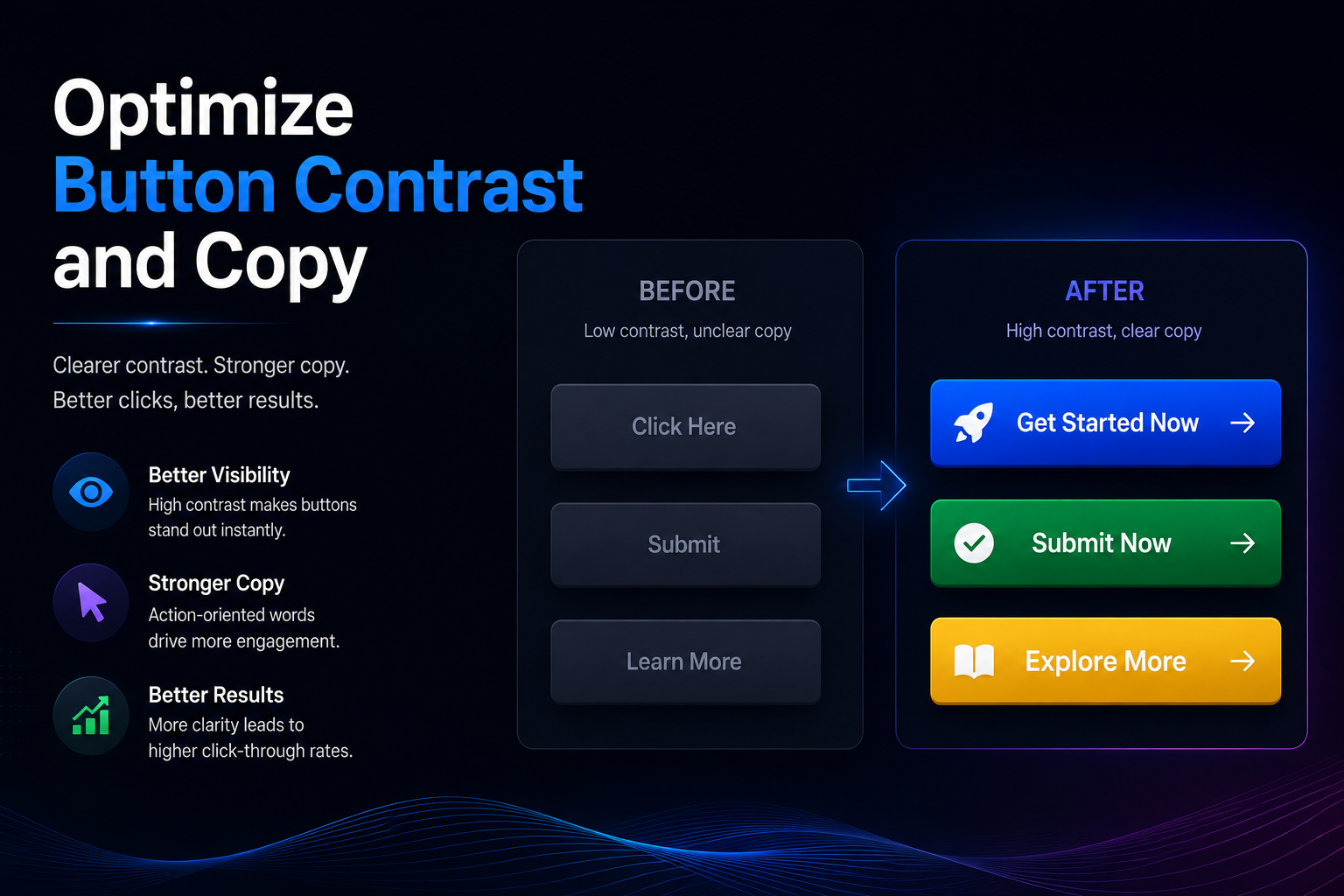
A call to action button that blends into the background of your website will be ignored. Similarly, a button that simply says “Submit” or “Click Here” fails to inspire action. Your buttons need to visually pop and clearly communicate the value of clicking.
How to fix it today:
- The Squint Test: Lean back, squint at your screen, and look at your homepage. If your main CTA button doesn't immediately stand out as the most obvious element on the page, change its color. Use a high-contrast complementary color to your brand's primary palette.
- Upgrade the Copy: Change passive text to value-driven, first-person action verbs. Instead of: "Submit" Try: "Get My Free Audit" Instead of: "Contact Us" Try: "Talk to an Expert Today"
Eliminate Mobile Layout Friction
Over half of all global web traffic comes from mobile devices. If your website is merely a “shrunken down” version of your desktop site, you are likely bleeding mobile leads. Mobile users are impatient and navigate with their thumbs, meaning small errors cause massive bounce rates.
How to fix it today (from your phone):
- Fix Tap Targets: Ensure your buttons and links are large enough to be easily tapped with a thumb without accidentally clicking the link next to it. Space them out appropriately.
- Check Font Sizes: Your body text should be easily readable without the user having to pinch and zoom. A minimum of 16px is generally recommended for mobile readability.
- List Item Kill the Horizontal Scroll: If an image or a table is forcing users to scroll sideways to see the whole page, resize it or hide it on mobile devices immediately.
Inject Trust Signals Near Conversion Points
Visitors are naturally skeptical. Before they hand over their email address or credit card information, they need reassurance. Often, SMBs bury their testimonials on a dedicated “Reviews” page that no one visits.
Trust signals need to be integrated at the exact moment a user is deciding whether or not to take action.
How to fix it today:
- Proximity is Key: Place a short, powerful customer quote directly beneath your primary contact form or pricing table.
- Use Real Faces: If possible, include a small headshot of the person who gave the testimonial. It dramatically increases credibility.
- Show Badges: If you are certified by a major platform (e.g., Google Partner, BBB Accredited, industry-specific awards), place these logos near the bottom of your homepage or on your checkout/lead form pages.
The Next Step for Your Business Growth
Implementing these five tweaks can create an immediate, measurable lift in your conversion rates. By reducing friction, clarifying your message, and building trust, your website stops acting like a passive digital brochure and starts functioning like a 24/7 sales representative.
If you have completed this 24-hour audit and are ready to take your digital presence to the next level with advanced functionality, custom web design, or a comprehensive digital marketing strategy, partnering with a full-service IT and marketing agency can help you scale rapidly.